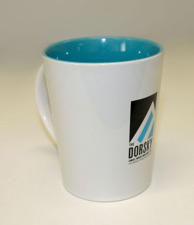
THE DORSKY
Dimensions: various (vector logo)
Color: various
The Samuel Dorsky Museum of Art wanted a new logo that would complement the College’s new logo, while as the same time establishing a unique and individual identity for the museum which would emphasize the word “Dorsky”. The museum is commonly referred to as “The Dorsky” by the campus community and patrons from the surrounding area. Using the new College logo as a base, I mimicked the pyramid shape (which represents “The Atrium” building on campus) as a frame for the tilted “D”. The top of the “D” also serves as a visual mountain reference to the nearby Shawangunk Ridge.
The primary color for the logo is pms639, but the unique aspect of this logo is that the color of the logo can be altered to fit the color-scheme of any exhibit.
I also created a completely revised Identity Manual for the museum.
This design won an award of Excellence from the UCDA.